The Cooking Club
I love exploring new colours and brands, so The Cooking Club was an exciting opportunity to work with a darker, more mysterious range of colours that I rarely get to play with.
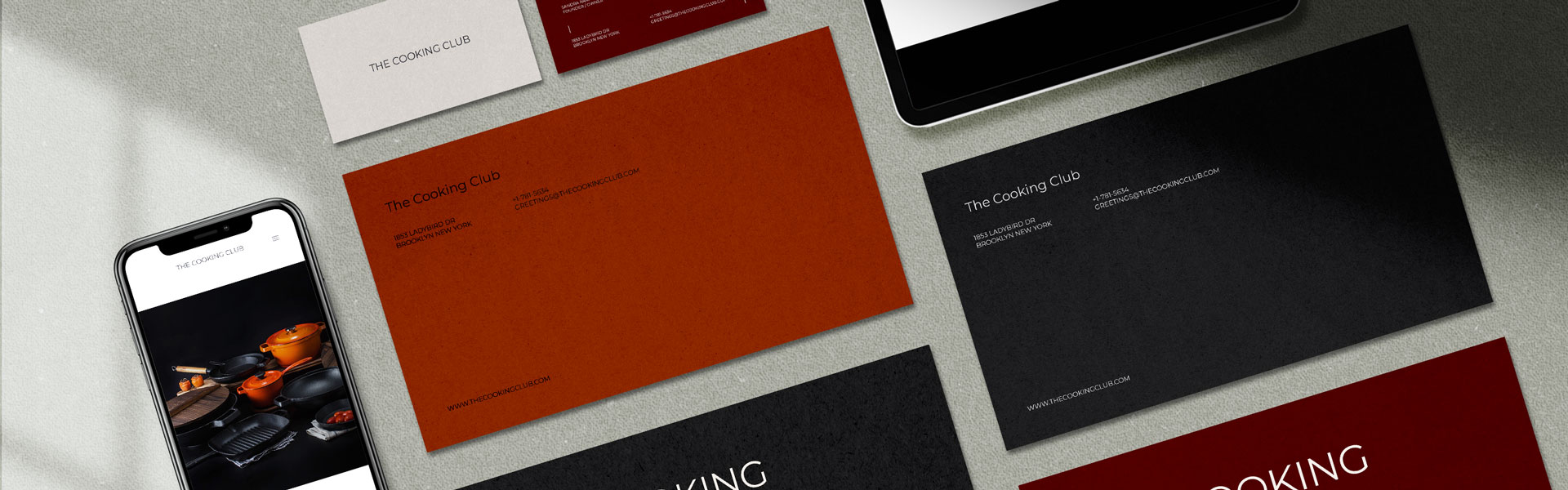
The Cooking Club case study was one that was born from a love of the warm colour palette presented in a stock photo found on Unsplash. When I first saw the photo, I was drawn into the way the deep oranges and reds reflected against the black background & darkness of the cooking utensils. I immediately saw a palette I was drawn to; one that inspired me to create a mockup for a fictional culinary-based company.

The Inspiration
This image was originally found on Unsplash - a website I frequently browse for high quality stock images that have very generous licensing agreements. Aside from the crispness of the image, I love how the light plays against the black pans and really brings to life the vibrancy of the orangey-red crockery and fresh ingredients.
Honestly, creating a mockup for The Cooking Club felt almost handed to me when I saw this image, but I'm glad I decided to turn it into something because I had fun with the colours.
Choosing the Colour Palette
Choosing the colour palette was easy enough because there was obvious high and low points in the image. The challenge came with choosing colours that interacted well but that were opposing enough to create a high contrast that could be used on a website or in print material.
Ultimately, a short time spent playing around in Adobe Capture on my iPhone gave me the colour palette I was after. Something warm to reflect the emotional and sensory experiences that come with culinary play, but also something bold enough to give The Cooking Club the brand statement I was after.


Bringing TCC to Life
Once I'd settled on the colour palette, I played around with some typefaces to come up with one that I felt suited the identity being created for The Cooking Club. I ended up settling on an old friend of mine (and one that many designers are fond of): the oh so adaptable Montserrat font.
Montserrat was a strategic choice for TCC because I wanted to instill a sense of traditionalist familiarity to the brand. It felt important to ensure the audience could sense the warmth and community from TCC. After all, a culinary brand like TCC is all about sharing recipes and cooking ideas to help the audience enhance that feeling of 'home-cooking' to their creations.
The mockup shown here is very preliminary because this was just a fun, free-time exploration of colour. This palette has some serious potential so who knows, in the future I might build this out further into a website and maybe some merch.
The mockup shown here is very preliminary because this was just a fun, free-time exploration of colour. This palette has some serious potential so who knows, in the future I might build this out further into a website and maybe some merch!